7QC Tools
Digital 7 QC Tools for Data-Driven Quality Improvement
Use the seven essential quality control tools in one digital platform to monitor processes, analyze data, identify root causes, and support continuous process improvement.
Trusted by Quality-Driven Organizations







Data-Driven Quality. Continuous Improvement.
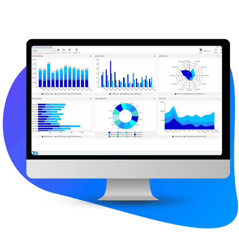
Live!QC Tools brings the classic 7 QC Tools into a digital quality environment, helping teams analyze process data, identify problems, and improve process performance.
Visualize
Quality Data
Use structured quality tools to understand process data and identify patterns.
Analyze Process
Performance
Monitor process variables and analyze factors affecting quality.
Drive Continuous
Improvement
Use data-driven insights to identify causes, reduce variation, and improve processes.
Essential Quality Tools, Fully Connected in One Platform
Use the seven classic QC tools to understand processes, analyze quality data, identify root causes, and support continuous improvement.
One Framework for Data-Driven Quality Improvement
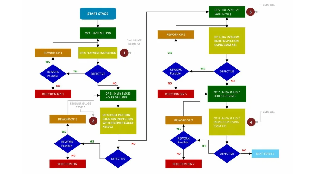
- Process Visualization: Simplify complex processes by visually mapping activities, decisions, milestones, and responsibilities.
- Workflow Standardization: Standardize workflows for consistent, process-driven execution.
- Bottleneck Identification: Identify bottlenecks, inefficiencies, and process waste.
- Collaboration & Improvement: Clarify roles, improve team collaboration, simplify training, and support continuous process improvement.
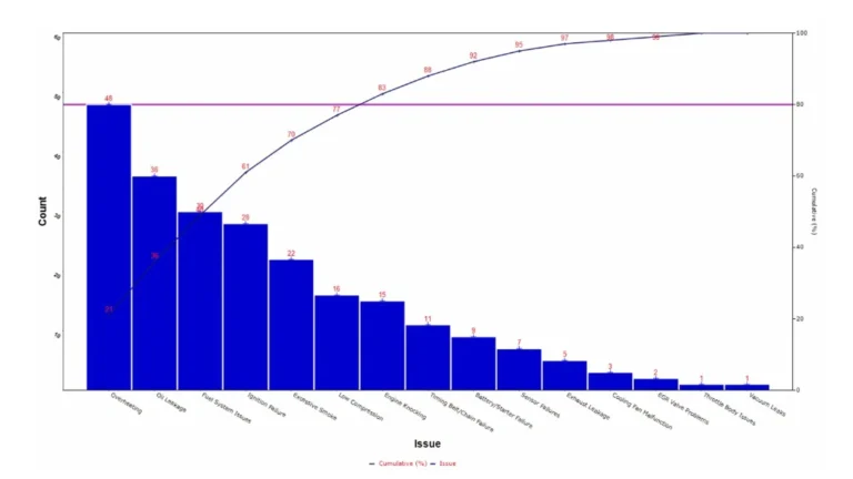
- Impact Analysis: Quantify the impact of key factors affecting process outcomes.
- Cause Prioritization: Identify and prioritize the most significant causes contributing to process issues.
- Focused Problem Solving: Reduce analysis time by focusing improvement efforts on high-impact causes.
- Data-Driven Decisions: Support faster issue identification and informed quality improvement decisions.
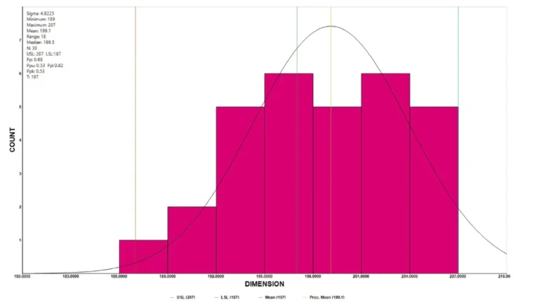
- Data Visualization: Convert numerical data into a clear visual format for easier analysis.
- Frequency Distribution: Group data into ranges to understand how values are distributed.
- Variation & Process Capability: Identify data spread, variation, and patterns that indicate process performance.
- Pattern Identification: Detect unusual or multi-modal patterns that may indicate underlying process issues.
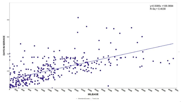
- Variable Relationships: Identify relationships or correlations between two variables through paired data points.
- Process Inter-Dependence: Analyze how changes in one parameter or process may relate to another.
- Cause Analysis: Support cause-and-effect analysis by highlighting potential relationships between factors.
- Data-Driven Improvement: Use relationship insights to support risk mitigation, process stability, and quality improvement.
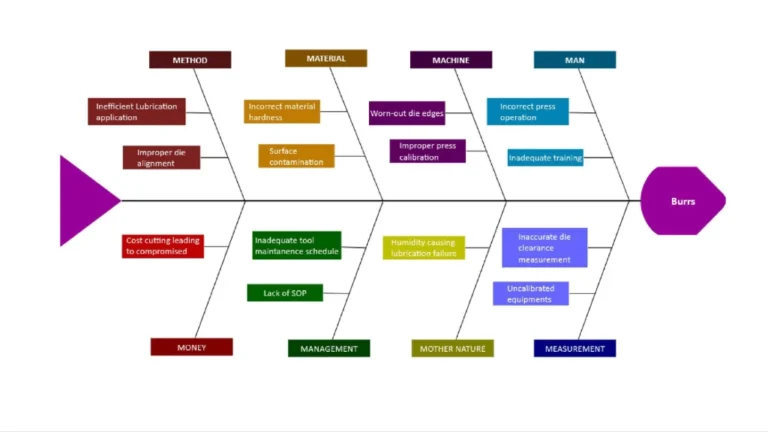
- Structured Cause Identification: Identify and organize possible causes contributing to a specific problem or effect.
- Cause Categorization: Group causes using categories such as Man, Machine, Method, Material, and Environment.
- Cross-Functional Analysis: Combine team knowledge for comprehensive problem analysis.
- Root Cause & Improvement: Identify root causes and support structured problem-solving.
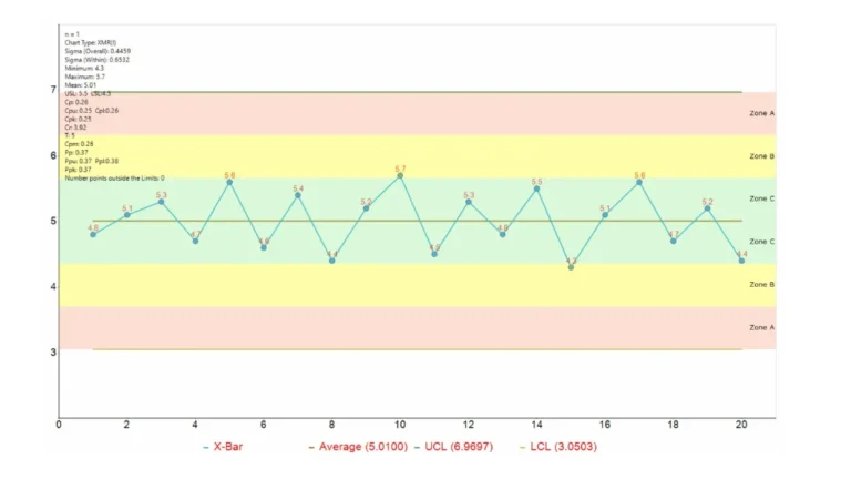
- Process Monitoring: Monitor process performance using variable data.
- Variation Analysis: Track process variation and identify changes from normal performance.
- Early Deviation Detection: Detect potential process deviations before they affect output quality.
- Corrective Action: Identify special causes and support timely corrective action.
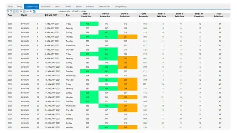
- Reliable Data Collection: Capture data consistently at the point of generation.
- Structured Data Recording: Record information in a reusable format across people, machines, processes, and methods.
- Complete Data Capture: Capture data within and outside specified limits for an unbiased view.
- Actionable Quality Data: Provide reliable data for performance evaluation and corrective action.
Got Questions? We’ve Got Answers
By combining structured quality tools with collaboration, action tracking, and historical records, organizations can monitor improvements, standardize best practices, and sustain process excellence.
Yes. Engineering, Production, Quality, Maintenance, and Management can securely access shared information with Live!QC Tools, ensuring everyone works with the same data and improving cross-functional collaboration.
Fishbone Diagrams let the whole team contribute causes by attaching evidence as reference at the same time. No waiting for meetings or lost inputs. Root causes are found faster, decisions happen sooner.
Every chart and diagram has version tracking, history, and audit-ready built in. What used to take extra documentation effort is now part of the workflow.
Visualize. Analyze. Improve.
7QC Tools empowers quality teams with the seven essential quality control tools in one digital platform-helping identify root causes, monitor process performance, reduce defects, and drive continuous improvement with data-driven decisions.